Case study
Nexenergie
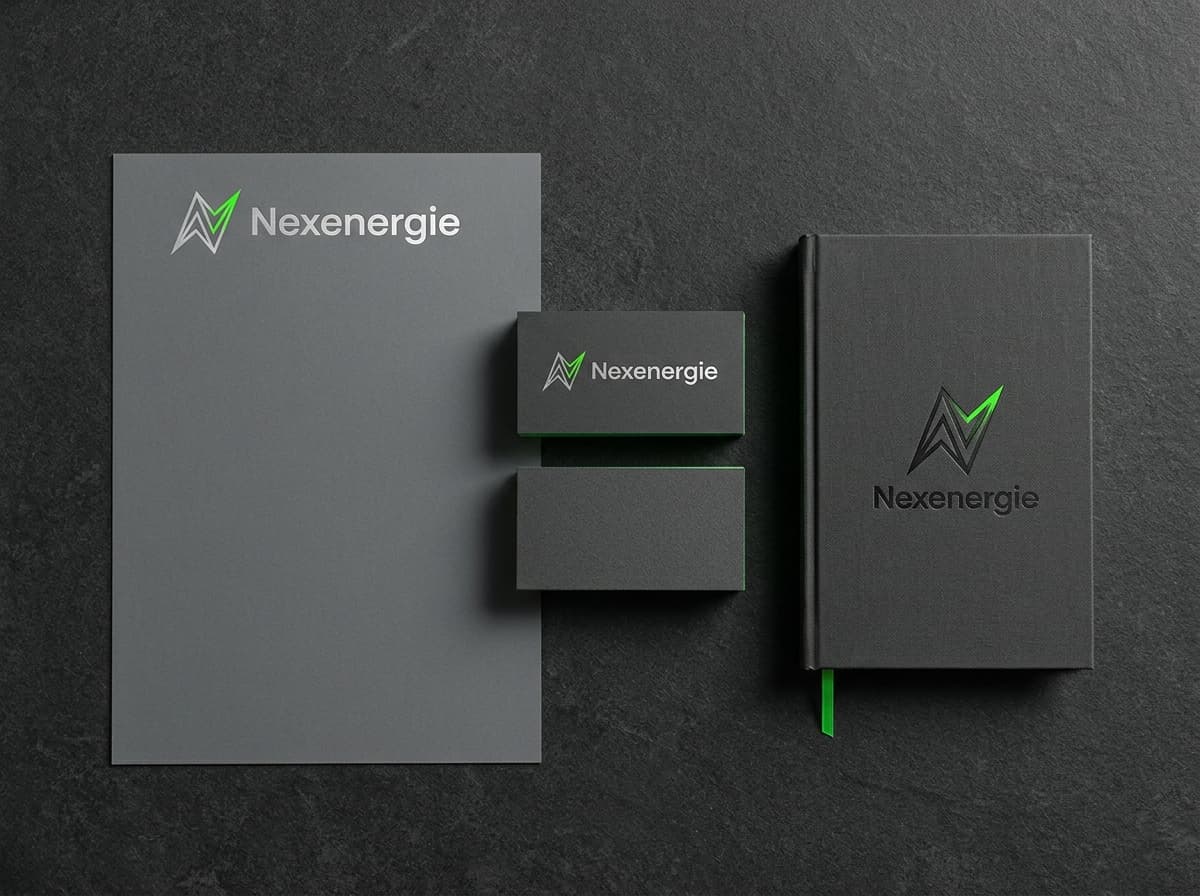
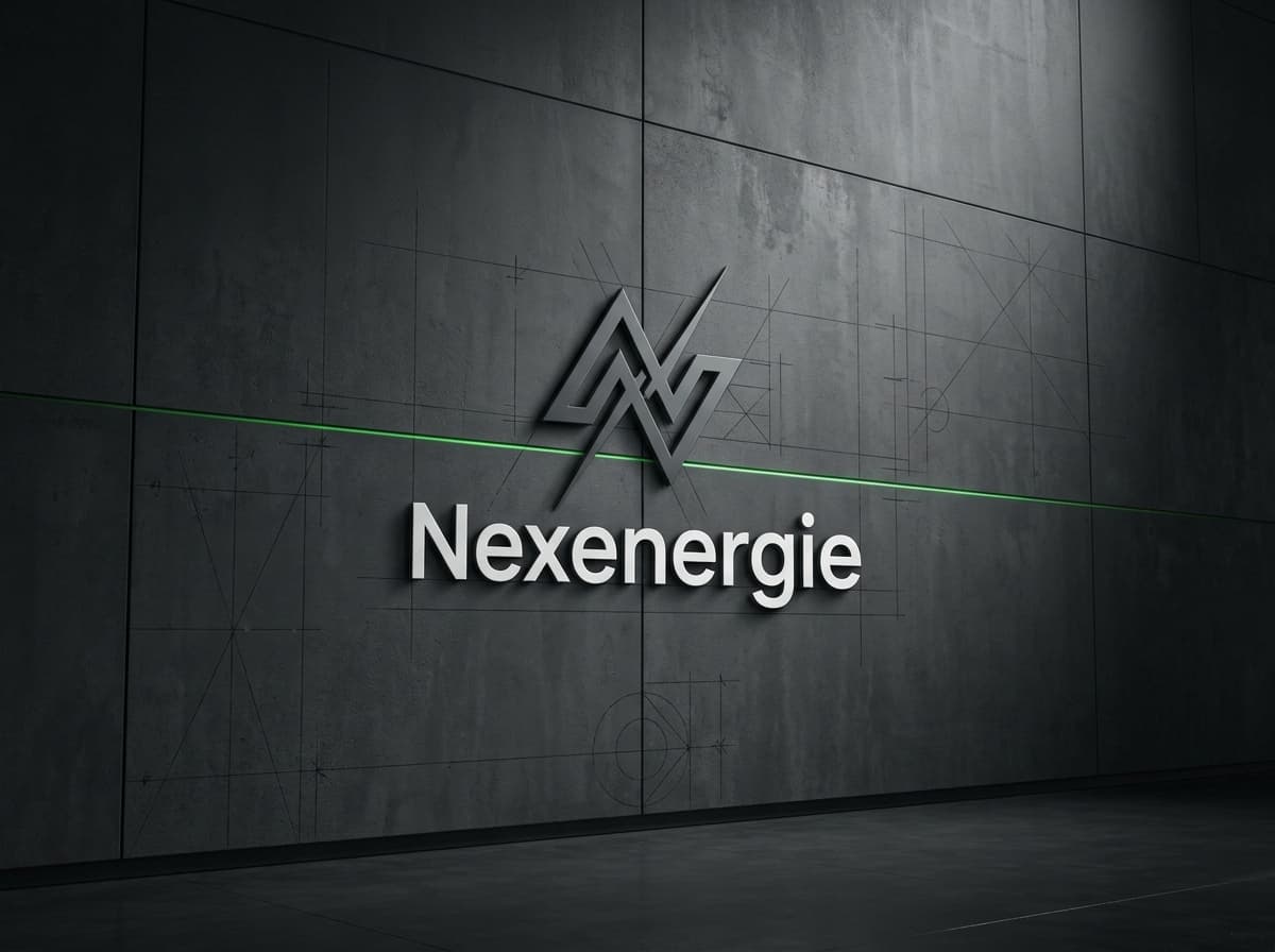
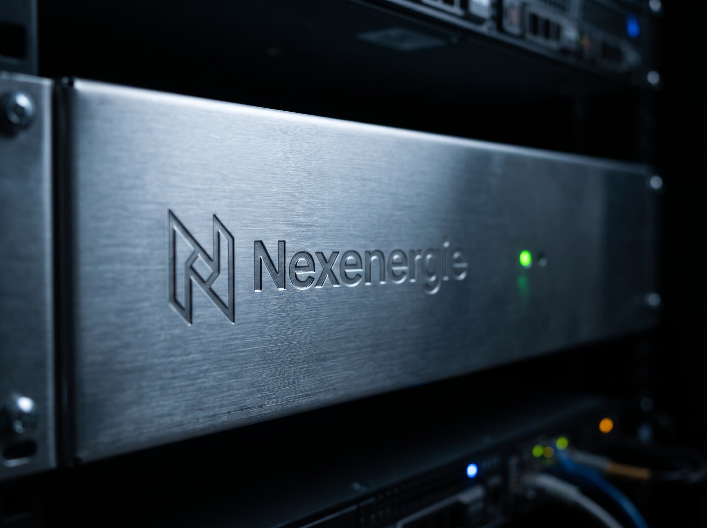
A logo for an energy technology company, built to look at home on a server rack and on a business card.
- Logo design
- Energy tech
The brief
Nexenergie needed a logo that says energy and engineering without falling back on lightning bolts. It had to stay sharp at favicon size, hold up when embossed in metal and work in a single colour.
What I designed
The mark is drawn on a strict construction grid, so every angle and curve repeats with purpose.
- A geometric logomark that reads at 16 pixels and on a three metre wall.
- A wordmark with custom spacing, paired with the mark in horizontal and stacked lockups.
- A restrained palette of graphite, steel grey and one electric green accent.
- Mockups for hardware, print and signage to test the mark in real conditions.
The result
A calm, technical identity that works on dark hardware and clean paper alike, delivered with clear usage rules so the team can apply it consistently.
“It was a pleasure working with Andrii on our logo design. … I'm very happy with the final result and would recommend Andrii to anyone looking for a professional and reliable designer.”